Logotype
The logotype is the main communication element of the company,
it is used for the majority of company material.
THE BASIC POSITIVE VARIANT OF THE LOGOTYPE
This is the basic positive variant of the logotype, positive in a white background.
This logotype variant is used for all business communication.

THE BASIC NEGATIVE VARIANT OF THE LOGOTYPE
This is the basic negative variant of the logotype, in white in a corporate coloured background.

THE UNICOLOUR POSITIVE VARIANT OF THE LOGOTYPE
In case it is impossible to use the basic variant of the logotype for technical reasons,
the simplified unicolour design is used.
THE UNICOLOUR NEGATIVE VARIANT OF THE LOGOTYPE
In case it is impossible to use the basic variant of the logotype for technical reasons,
the simplified unicolour design is used.
THE BASIC POSITIVE VARIANT OF THE LOGOTYPE
WITH NO CLAIM
This is the basic positive variant of the logotype, positive in a white background.
This logotype variant is used for all business communication.
THE BASIC NEGATIVE VARIANT OF THE LOGOTYPE
WITH NO CLAIM
This is the basic negative variant of the logotype, in white in a corporate coloured background.

THE UNICOLOUR POSITIVE VARIANT OF THE LOGOTYPE
WITH NO CLAIM
In case it is impossible to use the basic variant of the logotype for technical reasons,
the simplified unicolour design is used.

THE UNICOLOUR NEGATIVE VARIANT OF THE LOGOTYPE
WITH NO CLAIM
In case it is impossible to use the basic variant of the logotype for technical reasons,
the simplified unicolour design is used.

THE MINIMUM SIZE OF THE LOGOTYPE
The minimum size of the logotype guarantees its readability even in small formats.
When using smaller sizes, sufficient readability and effectiveness are not guaranteed.

THE MINIMUM SIZE OF THE LOGOTYPE WITH NO CLAIM

COLOURED BACKGROUND
A correct usage of the logotype in coloured backgrounds must ensure that it is readable
and that the colours of the logotype and the background go well together.
For the positive variant, white is a suitable background colour. For the negative variant
it is corporate grey or corporate green. Black for the unicolour version.

UNICOLOUR BACKGROUND – CORPORATE COLOUR TONE
A demonstration of the usage of the logotype in a background of a corporate colour tone.
For a 0–49 % hue,the basic positive variant of the logotype is used, for 50–100 % the negative
variant is used.

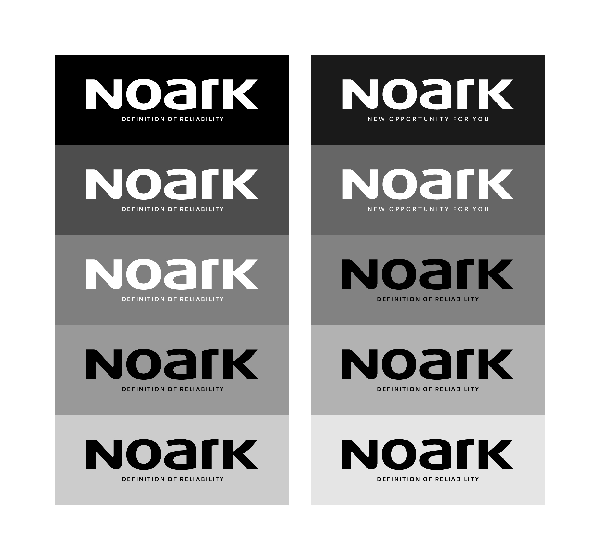
UNICOLOUR BACKGROUND – GREY TONES
A demonstration of the usage of the logotype in a grey background.
For a 0–49 % hue, the unicolour positive variant of the logotype is used,
for 50–100 % the negative variant is used.
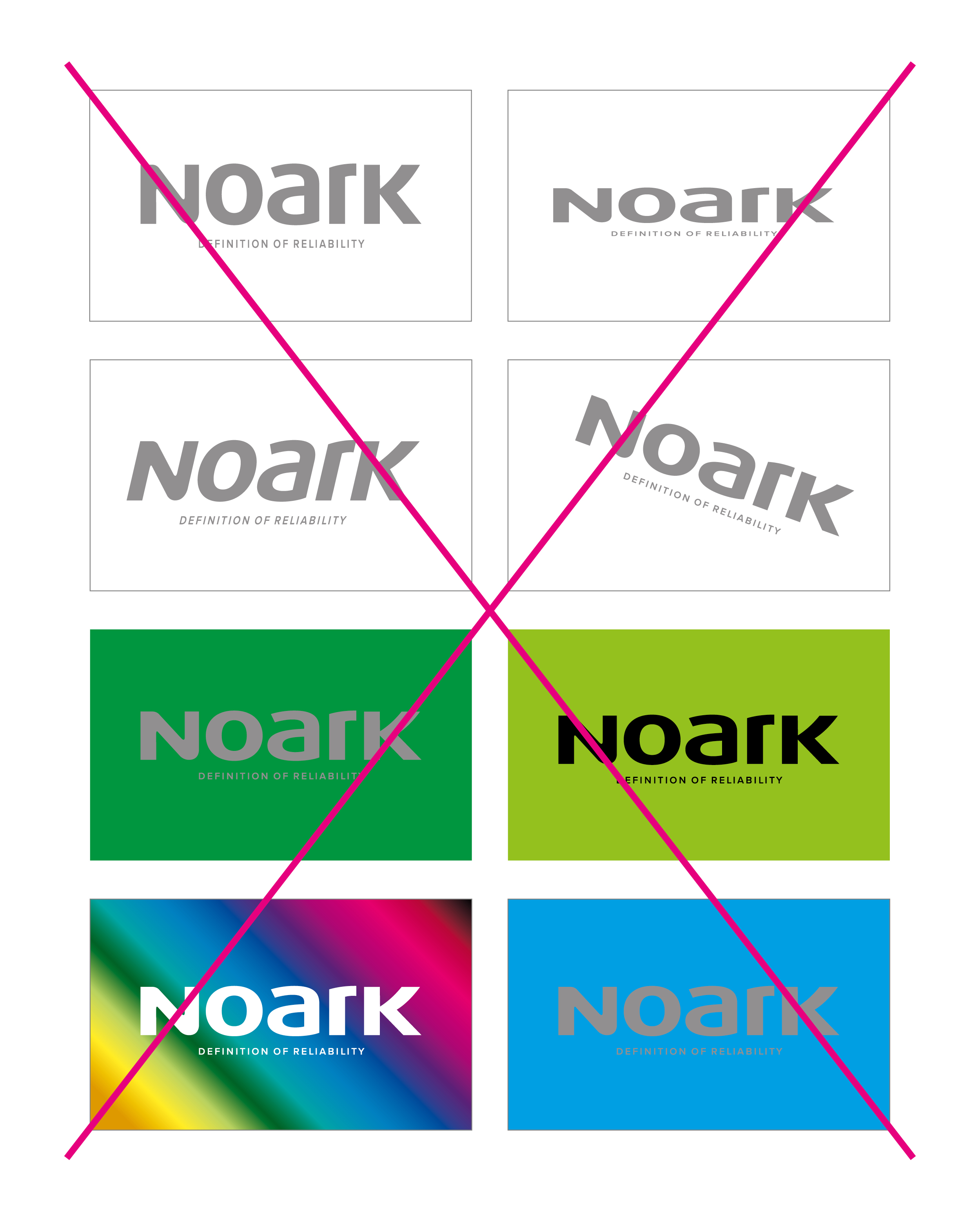
BANNED MODIFICATIONS OF THE LOGOTYPE
Here are some examples of banned variants of the logotype based on colour and shape.
Guarantee symbol
THE BASIC POSITIVE VARIANT – GUARANTEE SYMBOL
THE BASIC NEGATIVE VARIANT – GUARANTEE SYMBOL
UNICOLOUR POSITIVE VARIANT – GUARANTEE SYMBOL
In case it is impossible to use the basic variant of the symbol for technical reasons,
the simplified unicolour design is used.

UNICOLOUR NEGATIVE VARIANT – GUARANTEE SYMBOL
In case it is impossible to use the basic positive variant of the symbol for technical reasons,
the negative design is used.

MINIMUM SIZE – GUARANTEE SYMBOL
The minimum size of the symbol guarantees its readability even in small formats.
When using smaller sizes of the symbol, sufficient readability and effectiveness are not guaranteed.

COLOURED BACKGROUNDS
For the positive variant, white is a suitable background colour. For the negative variant
it is corporate grey or corporate green. Black for the unicolour version.

UNICOLOUR BACKGROUND – CORPORATE COLOUR TONE
A demonstration of the usage of the symbol in a background of a corporate colour tone.
For a 0–49 % hue, the basic positive variant of the symbol is used, for 50–100 % the negative
variant is used.

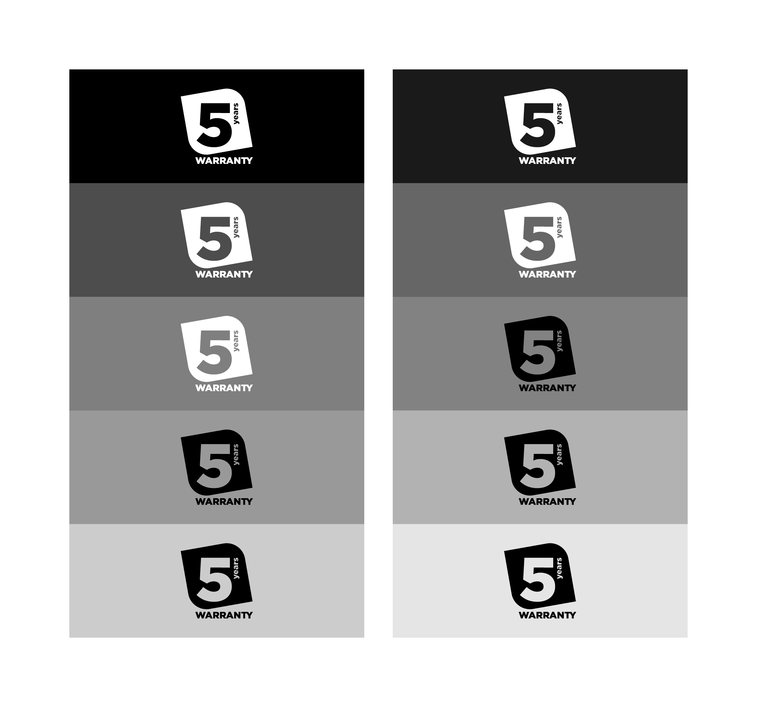
UNICOLOUR BACKGROUND – GREY TONES
A demonstration of the usage of the symbol in a grey background. For a 0–49 % hue,
the unicolour positive variant of the symbol is used, for 50–100 % the negative variant is used.
Graphic element
GRAPHIC ELEMENT – POSITIVE VARIANT
The graphic element in symbolising "pins" can be used in various modifications
visualised below.It can be used as a whole or only its individual segments.

GRAPHIC ELEMENT – NEGATIVE VARIANT
The graphic element in symbolising "pins" can be used in various modifications
visualised below. It can be used as a whole or only its individual segments.

Protection zone
The minimum protection zone of the "x" logotype is defined as ½ of the height of the letter "K".
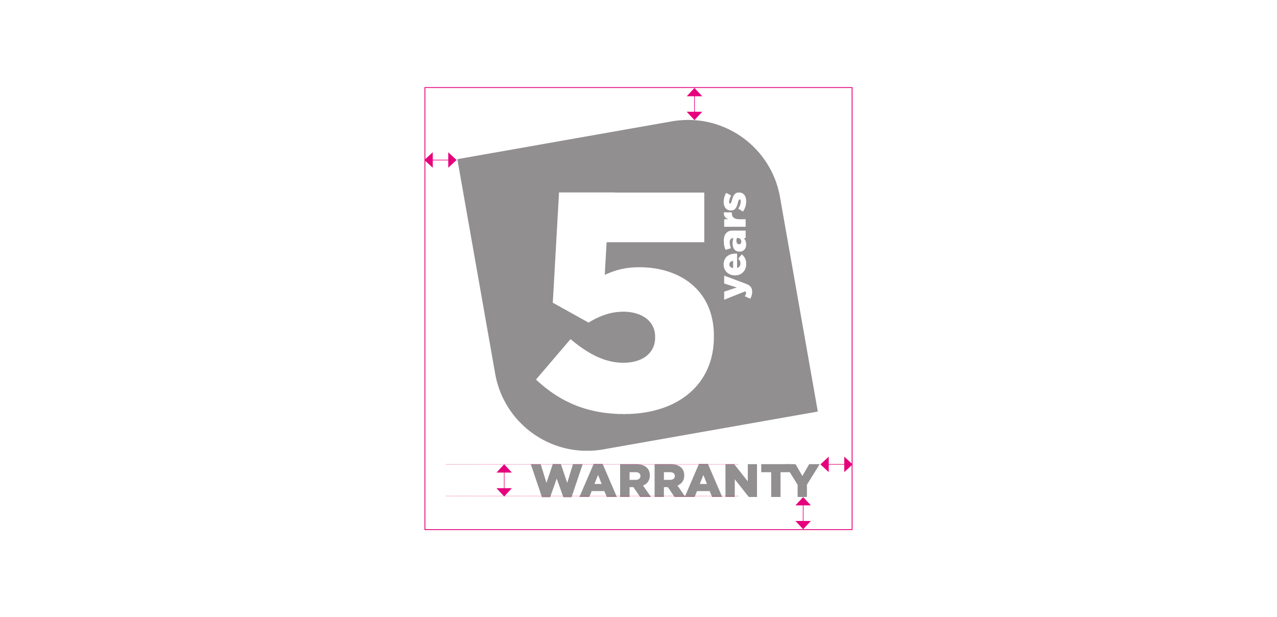
The minimum protection zone of the "x" guarantee symbol is defined by the height of the letter "A".
DESIGN

Colours
The company's uniqueness is significantly strengthened by the usage of basic colours.
Basic colours are a part of a united visual style and as such they represent an important means
of inducing a positive perception of the brand and therefore the company's image as well.
BASIC COLOURS
The basic colours of NOARK are corporate grey and green. When printing smaller formats,
it is possible to replace the CMYK composition of the grey colour with 65% black. There is also an alternative for the colour Cool Gray 8 C, where occasionally the silver metallic colour 877 C
can be used.


